How to Colour Grade for Social Media
The first time I graded a music video clip for Instagram, I spent four hours on the colour in DaVinci Resolve, exported it, uploaded it, and watched it go up looking like someone had put a grey filter over everything I'd done. The grade I'd built — the warm shadows, the lifted blacks, the skin tone work — all of it compressed into something flat and lifeless. I'd ignored the simplest rule in social media grading: the platform is part of your pipeline, not the end of it.
Colour grading for social media isn't the same discipline as grading for cinema or broadcast. You're grading for phones — watched in bright rooms, on screens with inconsistent colour profiles, after aggressive platform recompression. A grade that works for a filmmaker's Vimeo portfolio can survive all of that and still fall apart on TikTok.
Start with colour correction, not creative grading
Exposure balanced, white balance neutral, highlights not clipped, shadows not crushed. This isn't the creative work — it's the foundation that makes creative work possible. Skip it and your grade compensates for technical problems instead of building a look.
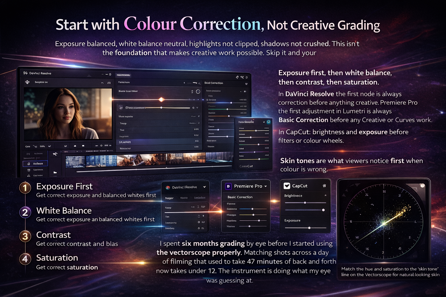
Exposure first, then white balance, then contrast, then saturation. In DaVinci Resolve the first node is always correction before anything creative. In Premiere Pro the first adjustment in Lumetri is always Basic Correction before any Creative or Curves work. In CapCut: brightness and exposure before filters or colour wheels.
Skin tones are what viewers notice first when colour is wrong. Not "the grade looks off." Just "something is weird about this person's face." On the vectorscope in DaVinci Resolve there's a line labelled "skin tone" running diagonally. Your subject's skin should fall near that line regardless of ethnicity — it represents the hue and saturation relationship that reads as natural. I spent six months grading by eye before I started using the vectorscope properly. Matching shots across a day of filming that used to take 47 minutes of back-and-forth now takes under 12. The instrument is doing what my eye was guessing at.
Use Rec. 709 SDR — everything else increases the risk
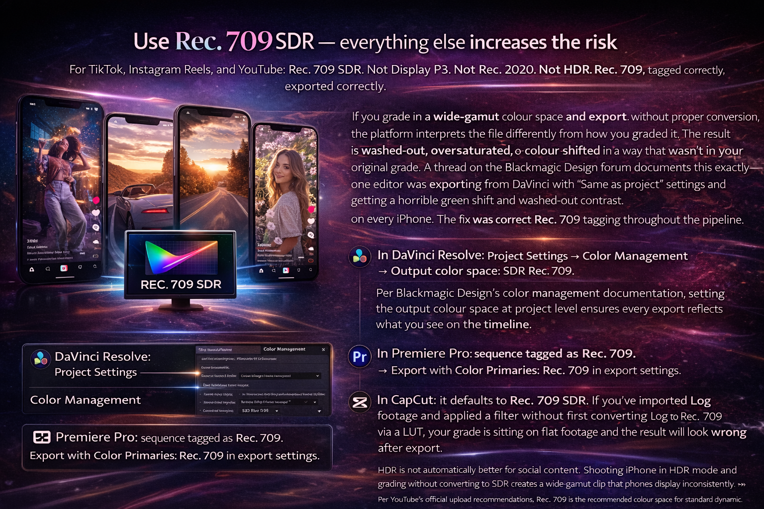
For TikTok, Instagram Reels, and YouTube: Rec. 709 SDR. Not Display P3. Not Rec. 2020. Not HDR. Rec. 709, tagged correctly, exported correctly.
If you grade in a wide-gamut colour space and export without proper conversion, the platform interprets the file differently from how you graded it. The result is washed-out, oversaturated, or colour-shifted in a way that wasn't in your original grade. A thread on the Blackmagic Design forum documents this exactly — one editor was exporting from DaVinci with "Same as project" settings and getting a horrible green shift and washed-out contrast on every iPhone. The fix was correct Rec. 709 tagging throughout the pipeline. I hit the same problem on my third solo project before I understood what was happening.
In DaVinci Resolve: Project Settings → Color Management → Output color space: SDR Rec. 709. Per Blackmagic Design's color management documentation, setting the output colour space at project level ensures every export reflects what you see on the timeline.
In Premiere Pro: sequence tagged as Rec. 709. Export with Color Primaries: Rec. 709 in export settings.
In CapCut: it defaults to Rec. 709 SDR. If you've imported Log footage and applied a filter without first converting Log to Rec. 709 via a LUT, your grade is sitting on flat footage and the result will look wrong after export.
HDR is not automatically better for social content. Shooting iPhone in HDR mode and grading without converting to SDR creates a wide-gamut clip that phones display inconsistently. Per YouTube's official upload recommendations, Rec. 709 is the recommended colour space for standard dynamic range uploads. The export settings that protect your colour work going into the upload are covered in depth in Best Export Settings for TikTok, Reels, and YouTube →
Grade for the phone, not the monitor
You're not grading for your editing monitor. You're grading for a phone screen, in a bright room, at arm's length. These are not the same viewing conditions.
A grade that looks cinematic on a calibrated monitor — subtle lifted blacks, gentle contrast, restrained saturation — often reads as flat and washed-out on a phone in daylight. Social media grading needs slightly more contrast, slightly cleaner highlights, and well-defined midtones to survive mobile viewing conditions.
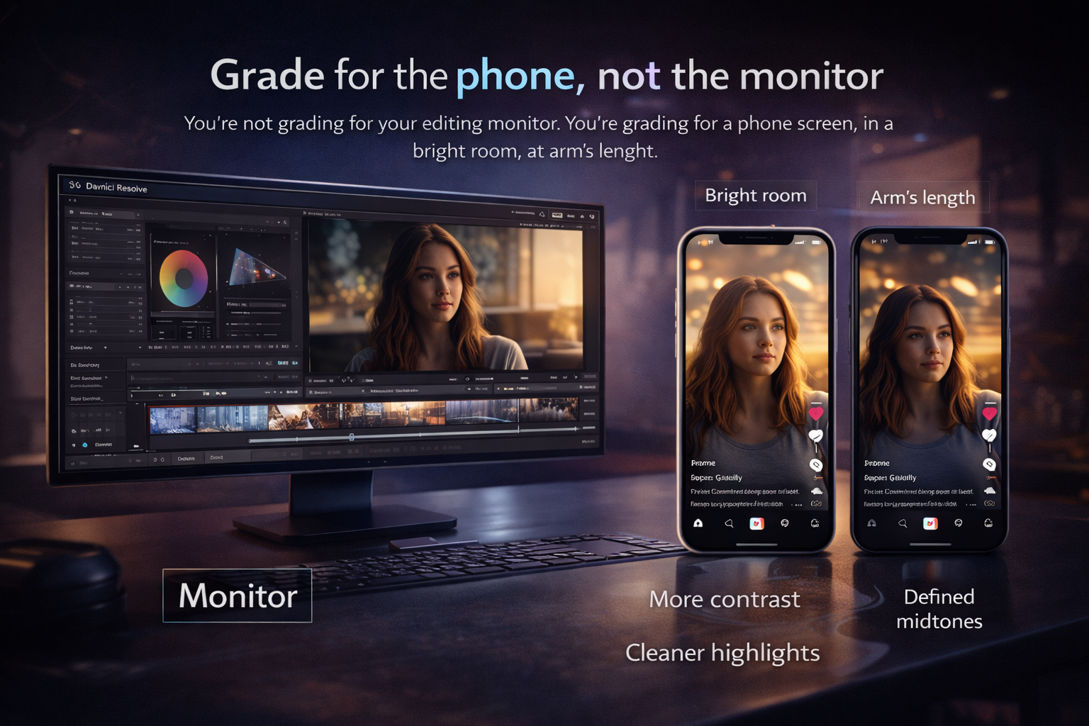
Grade on your monitor, then check on your phone before export. Not after upload — before. Transfer the file to your phone via AirDrop or cable and open it in the native gallery app. This shows you how the file looks before platform compression adds another layer. What looks good here survives the upload. What looks soft or flat here looks worse after TikTok or Instagram processes it.
If you have two phones — one iPhone and one Android — check both. iPhones render Rec. 709 content warmer and with more contrast than most Android phones on the same file. A grade that looks perfect on iPhone might look slightly cool and flat on a Samsung. Adjusting toward the middle gives the best average result across the widest audience. I started doing this on every project after noticing that a track I was happy with looked noticeably desaturated on my partner's Android — same file, same settings, different display rendering.
LUTs: what they do and when to use them
A LUT is a colour transformation file. They're used for two different things that get confused constantly.
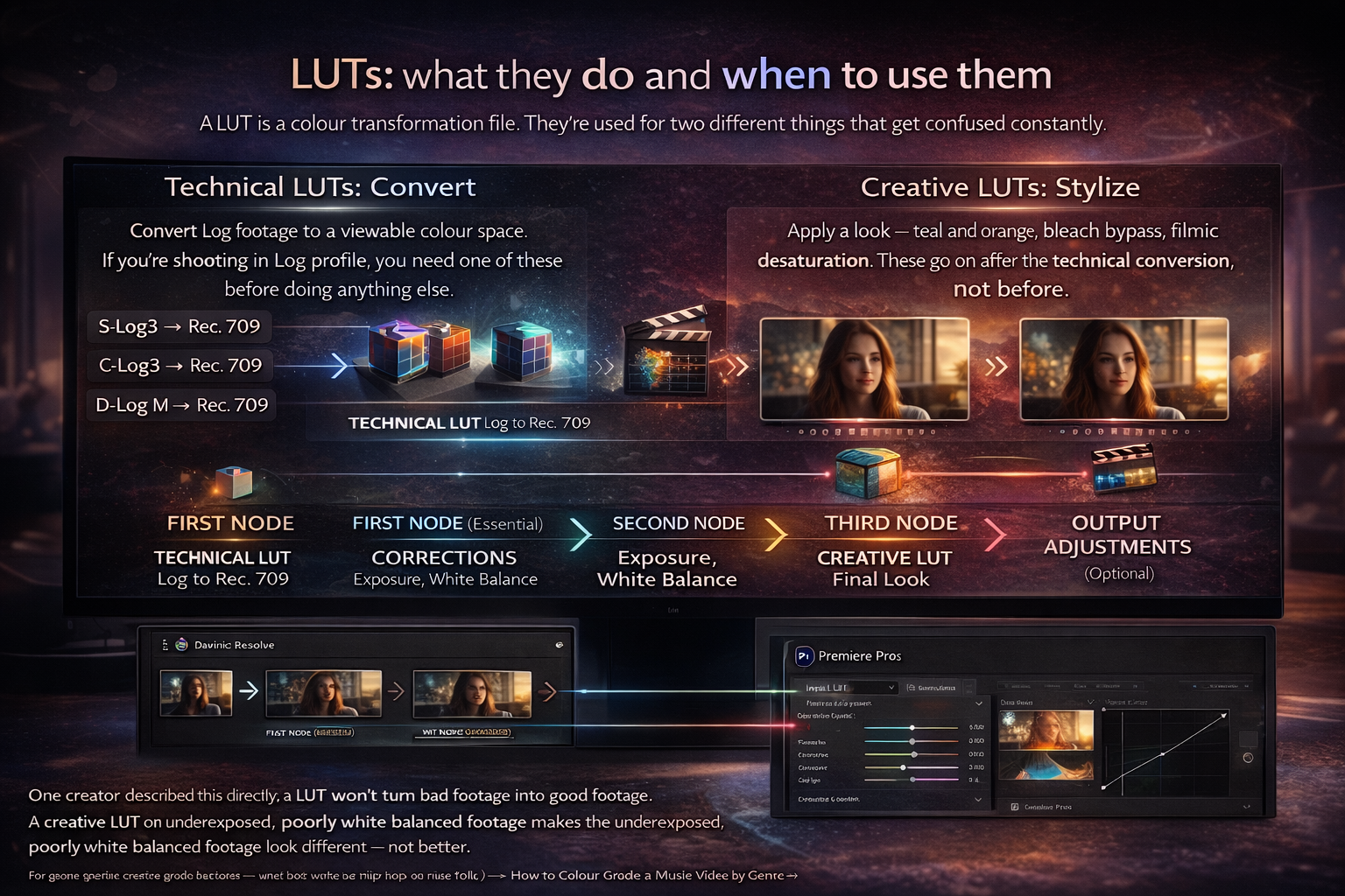
Technical LUTs convert Log footage to a viewable colour space. S-Log3 to Rec. 709. C-Log3 to Rec. 709. D-Log M to Rec. 709. If you're shooting in Log profile, you need one of these before doing anything else. Without it you're grading a flat, misleading image and your adjustments are working against the footage rather than with it.
Creative LUTs apply a look — teal-and-orange, bleach bypass, filmic desaturation. These go on after the technical conversion, not before.
The order in DaVinci Resolve: first node — technical LUT (Log to Rec. 709). Second node — corrections (exposure, white balance). Third node — creative look. Fourth node if needed — output adjustments. In Premiere Pro this maps to: Input LUT in Lumetri Basic Correction, then manual corrections, then Creative LUT or manual curves.
One creator described this directly: a LUT won't turn bad footage into good footage. A creative LUT on underexposed, poorly white-balanced footage makes the underexposed, poorly white-balanced footage look different — not better. The first time I bought a paid LUT pack I applied one straight to uncorrected S-Log footage and thought the LUT was broken. It wasn't. My base grade was wrong. The LUT amplified that. For genre-specific creative grade decisions — what look works for hip-hop vs indie folk — How to Color Grade a Music Video by Genre →
Colour grading in CapCut for social content
CapCut's colour tools are more capable than most creators use them for. The Adjust panel gives access to brightness, contrast, saturation, temperature, tint, highlights, shadows, and sharpness. The Curves tool gives independent control over luminance, red, green, and blue channels. For most short-form content these are sufficient for a clean, polished grade without opening DaVinci or Premiere.
The workflow that works: correction adjustments first (brightness, contrast, temperature/tint for white balance), then a filter at 30–50% intensity rather than 100%. Full-intensity filters look over-processed on mobile — pulling back by half gives you the mood without the artificiality. Then return to the Adjust panel to add back any saturation or contrast the filter removed.
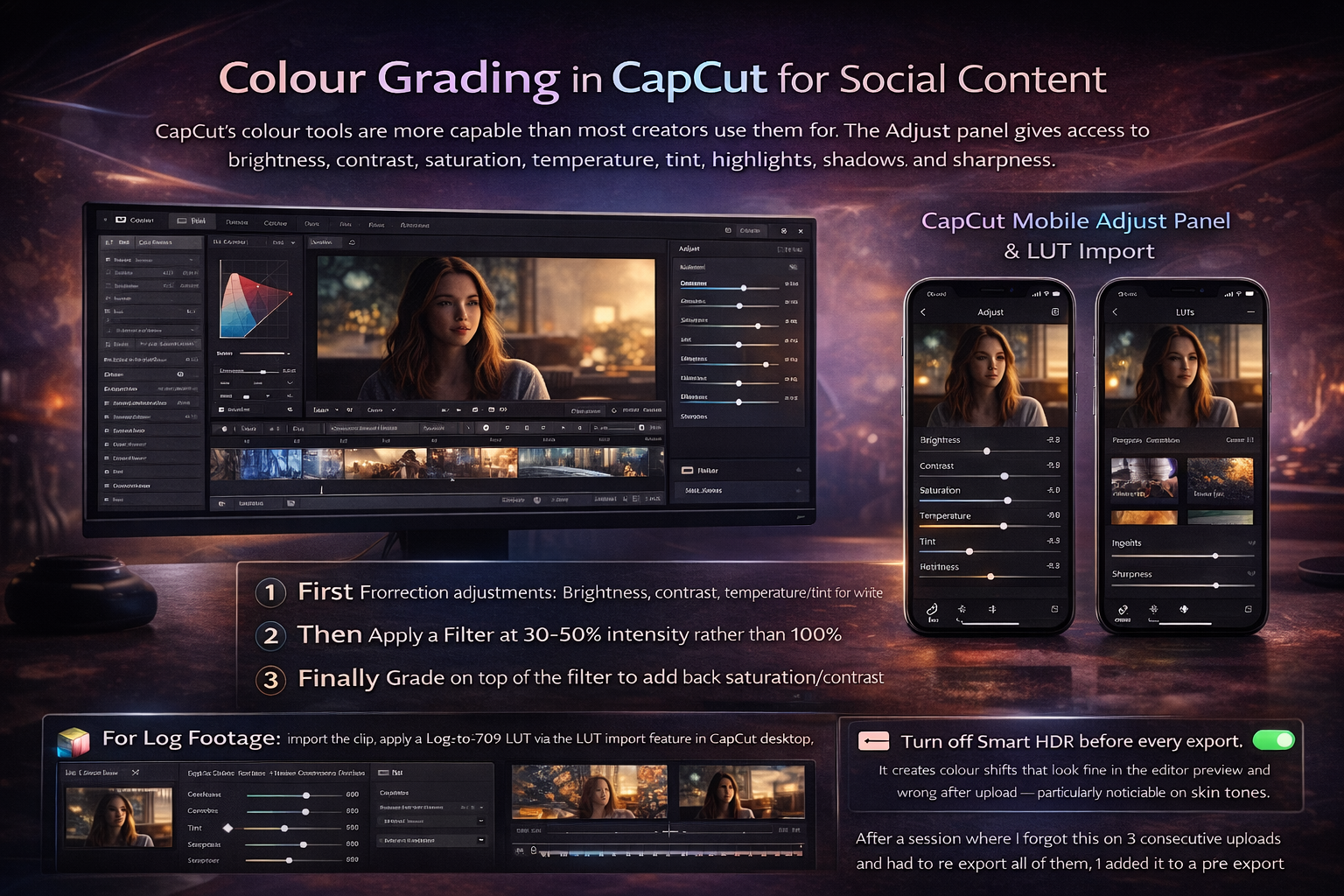
For Log footage: import the clip, apply a Log-to-709 LUT via the LUT import feature in CapCut desktop, then grade on top of the converted image. CapCut mobile's LUT support is more limited — if you're regularly working with Log footage, CapCut desktop handles the pipeline more reliably.
Turn off Smart HDR before every export. It creates colour shifts that look fine in the editor preview and wrong after upload — particularly noticeable on skin tones. Not a setting you check once. Every export. After a session where I forgot this on 3 consecutive uploads and had to re-export all of them, I added it to a pre-export checklist I run through before every project.
Consistency across a project
For music video work — cutting between multiple takes shot at different times of day, different lighting — shot matching is often more important than the creative grade itself. A technically correct grade that's inconsistent across shots is more distracting than a moody grade that's perfectly matched.
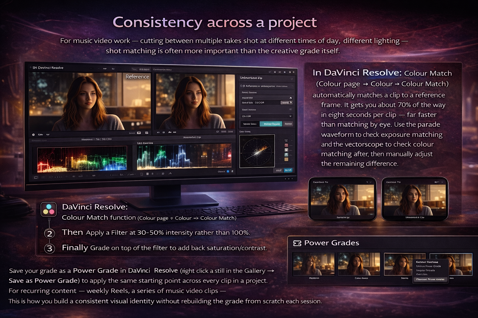
In DaVinci Resolve: Colour Match function (Colour page → Colour → Colour Match) automatically matches a clip to a reference frame. It gets you about 70% of the way in eight seconds per clip — far faster than matching by eye. Use the parade waveform to check exposure matching and the vectorscope to check colour matching after, then manually adjust the remaining difference.
In Premiere Pro: Lumetri's Comparison View puts two clips side by side. Use the colour wheels to match them visually.
In CapCut: no automatic colour match — you match manually by copying correction settings from one clip and applying them to the next, adjusting for lighting differences.
Save your grade as a Power Grade in DaVinci Resolve (right-click a still in the Gallery → Save as Power Grade) to apply the same starting point across every clip in a project. For recurring content — weekly Reels, a series of music video clips — this is how you build a consistent visual identity without rebuilding the grade from scratch each session.
FAQ
What colour space should I use for social media? Rec. 709 SDR for everything — TikTok, Instagram Reels, YouTube Shorts, and long-form YouTube. It's the standard every platform interprets consistently and every phone displays correctly. HDR and wide-gamut colour spaces increase the risk of colour shifts and display inconsistencies across different devices and apps.
How to colour grade for Instagram specifically? The same Rec. 709 SDR workflow applies, but Instagram's compression on fast motion and saturated content is more aggressive than TikTok's. Push contrast and saturation slightly higher than you think you need — Instagram will compress some of it out. Check specifically on the Instagram app after upload by viewing the reel on your own profile. Creator Studio and web uploads compress more aggressively than the mobile app.
Why does my grade look different after uploading? Usually one of three causes: wrong colour space tagging (not Rec. 709), grading Log footage without converting to Rec. 709 first, or a gamma shift from the QuickTime/export pipeline on Mac. Check your project colour space settings, verify the output is tagged Rec. 709, and check on your phone before uploading.
What is the 60/30/10 rule in filmmaking? A composition guideline — 60% of the frame uses a dominant colour, 30% a secondary colour, 10% an accent colour. For social media grading it's useful as a reference when building a look: decide what your dominant, secondary, and accent colours are before you grade, then use the Hue vs Saturation curve in DaVinci to push those relationships rather than adjusting everything uniformly. It stops grades from feeling random.
What is a LUT and should I use one? A LUT is a colour transformation file. Technical LUTs convert Log footage to Rec. 709 — use these if you shoot in Log profile. Creative LUTs apply a look on top of corrected footage. Apply creative LUTs at 60–70% intensity and adjust skin tones manually on top. A LUT on uncorrected footage makes the problems look different, not better.
Can ChatGPT or AI colour grade videos? AI colour tools exist and they work for basic correction — DaVinci Resolve's Neural Engine, Premiere's Auto Color, CapCut's one-tap filters. They're useful as a starting point for high-volume social content where you need consistent, fast results. They're unreliable for skin tones on footage shot in complex or mixed lighting, and they can't account for the creative intent of a specific grade. Use AI tools to get to 60–70% quickly, then correct manually. Don't export without reviewing AI-adjusted grades, particularly skin tones.
What colours attract people on social media? High contrast combinations — bright against dark, warm against cool — read better on mobile screens in bright environments. Saturated colours perform better in thumbnails and feed previews than desaturated or muted grades. Warm grades (golden, amber, sunset tones) consistently get higher engagement on lifestyle and music content. That said, visual consistency with your own content history matters more than chasing any single colour trend — viewers recognise a consistent aesthetic before they consciously register individual colours.
How do I get consistent skin tones? On the vectorscope in DaVinci Resolve, there's a diagonal line labelled "skin tone." Your subject's skin hue should fall near this line after white balance correction. If it's drifting significantly off the line, skin reads as cool, green, or magenta rather than natural. Use the Hue vs. Hue curve to nudge skin hues back toward the line without affecting the rest of the image. The Frame.io guide to skin tones in DaVinci Resolve goes deep on this if you're working with diverse subjects across different lighting conditions.
How do I colour grade for free? DaVinci Resolve free handles professional-grade colour work at no cost — the Color page, node-based workflow, scopes, and LUT management are all in the free version. CapCut's colour tools are free and sufficient for most social content. Free LUT packs from DJI (for DJI camera footage), Blackmagic Design, and community creators on Gumroad cover most common Log-to-709 conversion needs.