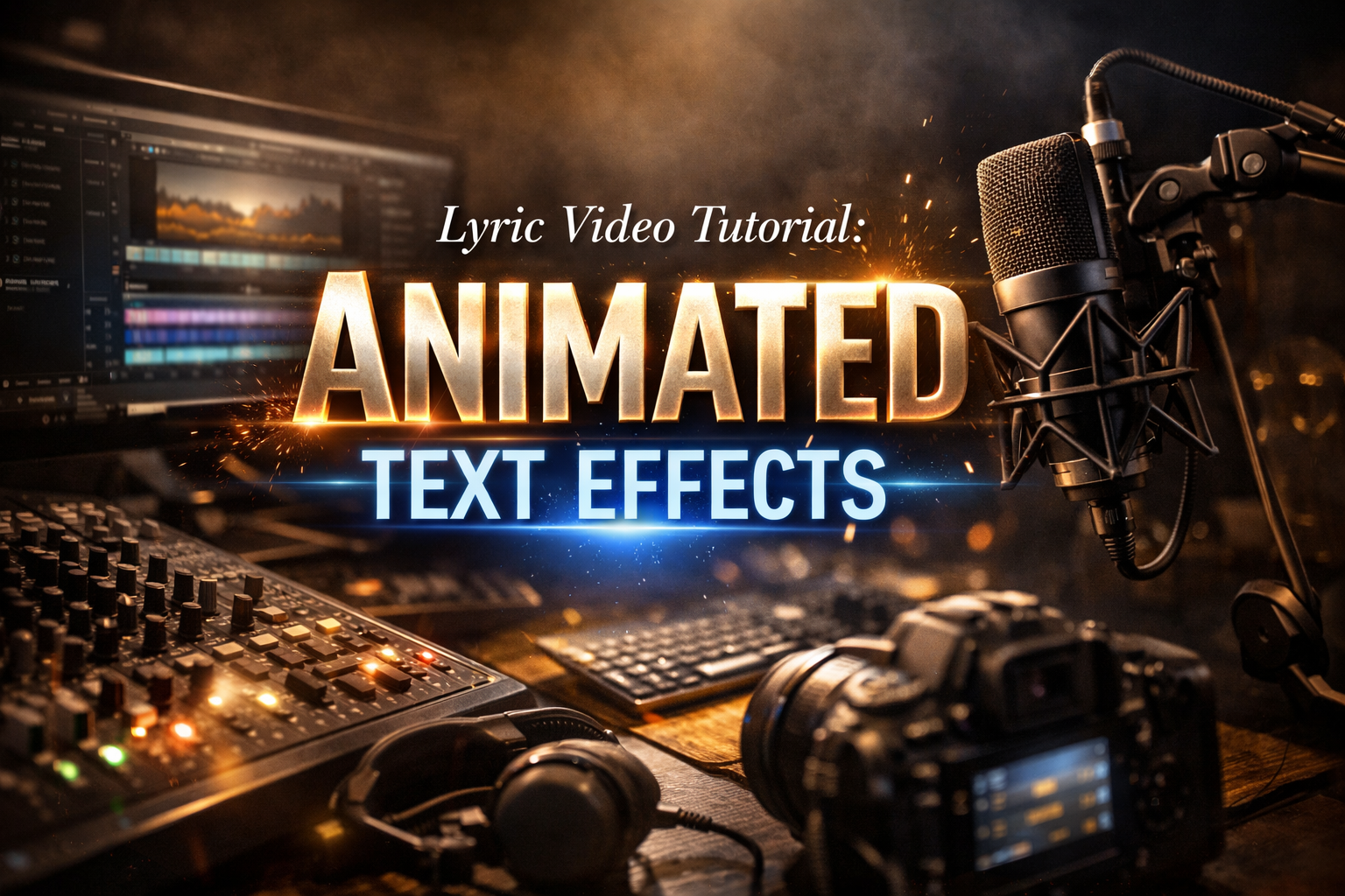
Lyric Video Tutorial: Animated Text Effects
The first lyric video I made took eleven hours. Same four lines of text, cycling through a whole song, fading in and out on a gradient background I'd downloaded off a free site. My girlfriend watched it back and said "nice." I knew it was bad. The text appeared on screen like a PowerPoint transition and just sat there until the next line. No movement, no rhythm — nothing that felt connected to the music.
The viewer doesn't think "the animation is bad." They just start looking at their phone.
This is how to make animated text effects that actually work, from the basics through to kinetic typography — in DaVinci Resolve, Premiere Pro, After Effects, and CapCut.
Before you touch the timeline
Two things kill lyric videos before the animation even starts: wrong lyrics and bad timing.
Wrong lyrics in a lyric video get noticed immediately and the comments don't forget. Source from the original artist or an official lyric sheet. Check against the recording line by line — don't rely on auto-generated lyric sites. They're wrong more often than expected, especially on fast verses. I caught three errors in a track I thought I knew well just by going word by word at 0.5x playback.
For timing: import your audio and zoom into the waveform until individual syllables are visible as peaks. The moment a peak hits is the moment the text needs to appear. Eyeballing the timing during playback gets you to within half a second. Working from the waveform gets you to within two frames. The difference between those two numbers is whether the video feels synced or just near the music.
Font before animation. A good font with simple timing beats a bad font with elaborate effects every time. One typeface for the main lyrics, one contrasting weight or style for emphasis. More than two and the video starts to feel like a ransom note. Match the typeface to the song's energy — heavy sans-serif for something hard, a flowing script for something slower. Set the base size large enough to read on a phone screen. Everything else is adjustable.
Opacity fade — where everyone starts
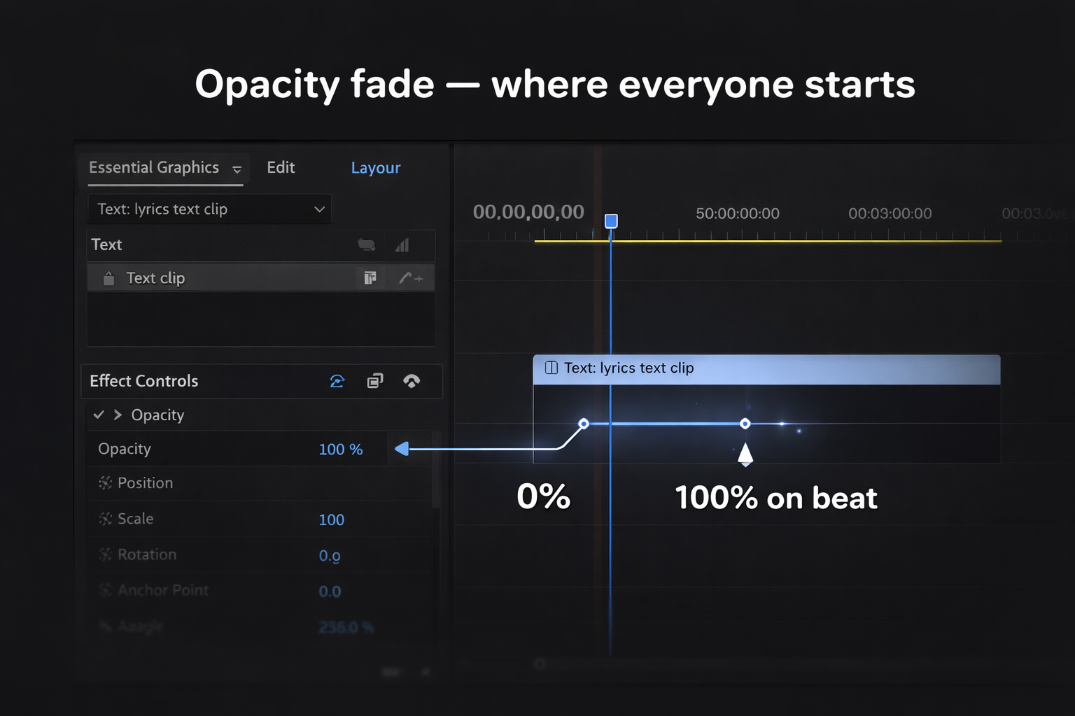
The simplest approach: text fades in on the beat, fades out before the next line. In Premiere Pro or DaVinci Resolve, two opacity keyframes per line — 0% one frame before the beat, 100% on the beat. Add a short ease on the way out.
It sounds too simple. It isn't. I spent four hours building a distortion effect for one video, rendered it, watched it back, and reverted to fades. The distortion was fighting the visual rhythm instead of supporting it. A clean fade with good font choice and a strong background is more watchable than a badly timed glitch effect — every time, without exception.
Where fades work: slow to mid-tempo tracks with space between phrases. Ballads, lo-fi, ambient. Anything unhurried.
Where they fall short: high-energy tracks where the text needs to feel as aggressive as the music. A gentle fade on a hard bass drop reads wrong before you can even explain why.
In CapCut mobile: add a text layer → tap the layer → Animate → choose an In animation (Fade is under Basic). Set duration to match the beat. For a full song this takes about 40 minutes once you have a system. For a first attempt, budget double.
Mask reveal — cleaner than a fade
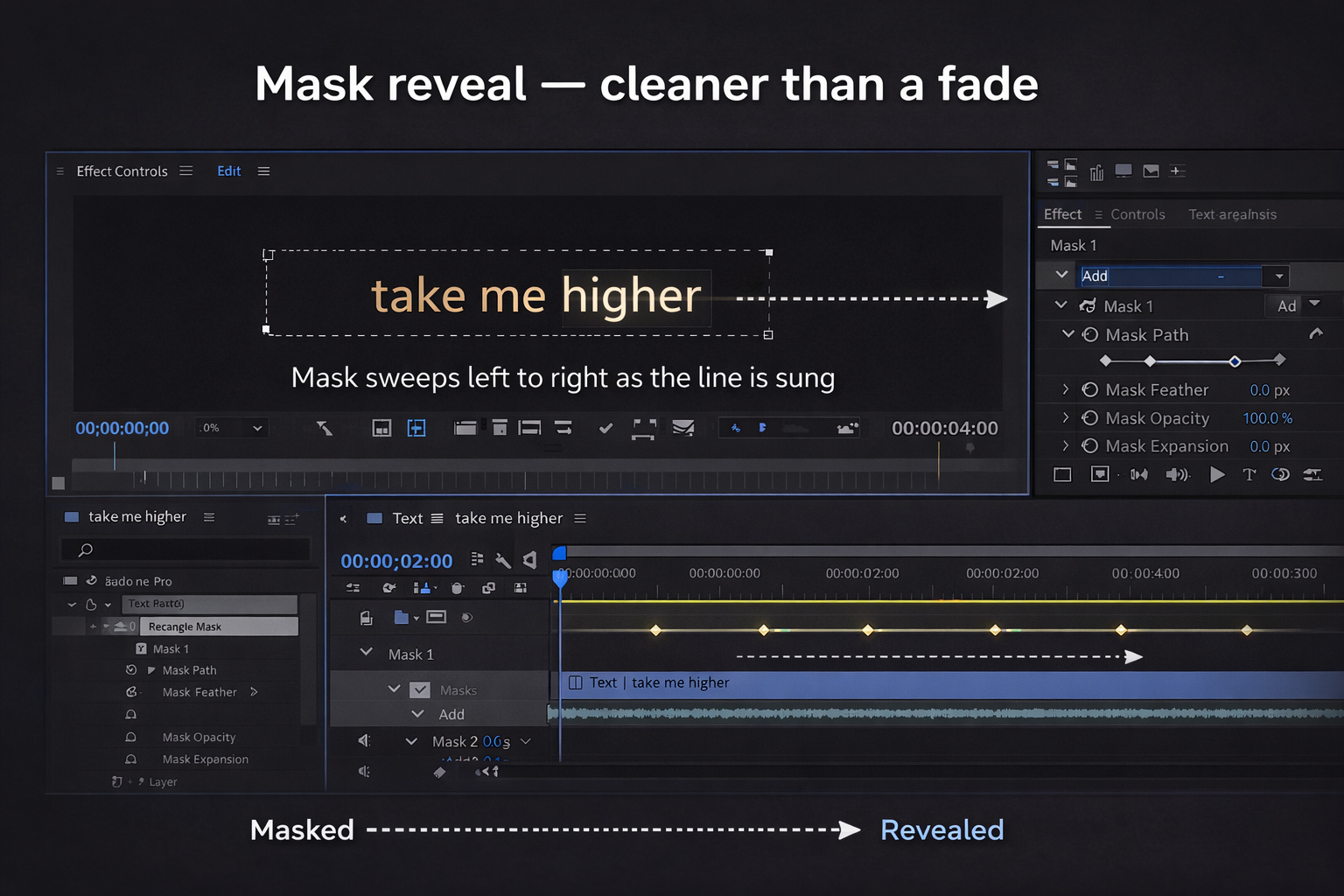
Instead of the whole word appearing at once, a mask sweeps left to right across the text as it's sung. The word materialises as the singer says it. The effect is subtle — the viewer probably can't name what's different — but the difference in how it reads is significant. Text that appears feels placed. Text that reveals feels performed.
In After Effects: create your text layer, add a Rectangle mask, set to Add mode, keyframe the mask's right edge moving from the left of the text to the right over the duration of the word. Each word takes about six keyframes to set up properly.
In DaVinci Resolve Fusion: add a Rectangle node masked to your text node, animate the Width parameter from 0 to full across the word's duration. The free version handles this completely — no Studio upgrade needed. Per Blackmagic Design's documentation, Fusion compositing is included in the free version with no feature restrictions.
In Premiere Pro: use the Crop effect from the Transform category, keyframe the Right value from 100% down to 0% as the word plays. Per Adobe's Premiere documentation, Crop is a standard effect requiring no plugins.
I use this technique on almost everything now. Setup took me 23 minutes the first time. Every project after that: five minutes, because the node group copies over.
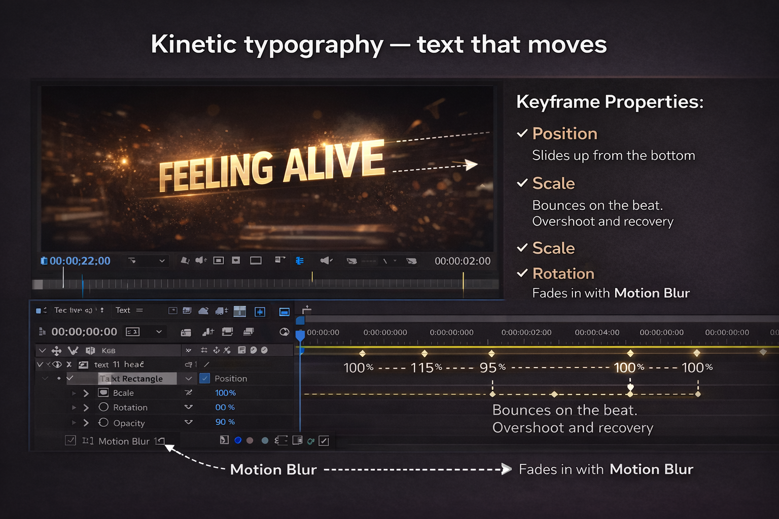
Kinetic typography — text that moves
Kinetic typography means the text moves throughout the video, not just appears and disappears. Words slide in from the edges, scale up on a kick, bounce on a snare. When it works, the text becomes a visual rhythm instrument. Someone on Zebracat described the failure mode exactly: using flashy text animations that distract from the music — like trying to read a book while someone throws confetti in your face.
Four properties to keyframe in After Effects:
Position — where text sits in the frame. Animate it sliding in from the bottom or side. Match movement speed to the energy of the beat it lands on.
Scale — text size. A word punching up to 120% on a bass hit and settling back to 100% over two frames reads as physical impact. Six keyframes to build, reusable forever after.
Rotation — tilt or spin. Use sparingly. A slight rotation on one emphasis word works. Continuous spinning text is almost always wrong.
Opacity — combine with the above. Text that scales up while fading in hits harder than either effect alone.
Motion blur — the detail most tutorials skip. In After Effects: Composition Settings → enable Motion Blur, then enable it per layer. Without it, fast-moving text teleports between frames. With it, the movement feels physical. Render time increases are worth it.
Typewriter effect: animate the Range Selector's Start value from 0% to 100% on a text layer's Tracking or Opacity property. Each character appears sequentially as the value sweeps. Good for rap verses where the delivery is fast and percussive.
Bounce: set Scale keyframes — 100% → 115% → 95% → 100% over eight frames on a downbeat. The overshoot and recovery is what makes it feel physical rather than mechanical.
For a free plugin that handles most of this automatically: PX-Kinetype from Pixflow gives 64 pre-built kinetic typography elements for After Effects, all customisable. Available at pixflow.net/product/px-kinetype-kinetic-text-typography — actually free, no watermark.
Syncing to the beat vs the word
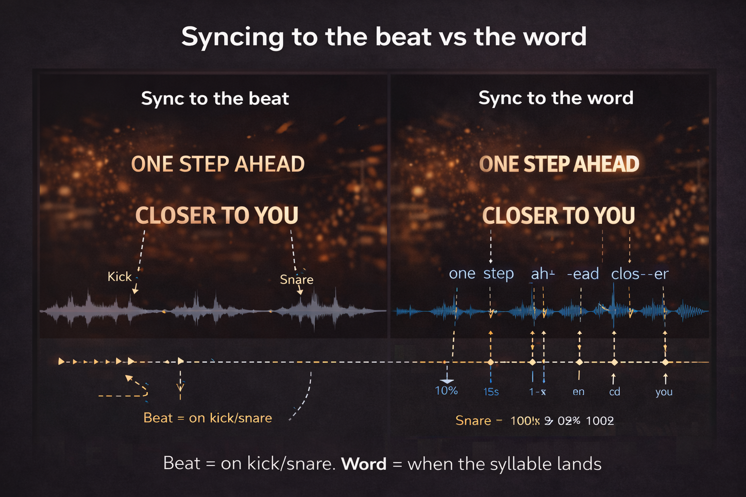
There's a difference. Choosing the wrong one for the track is a common mistake that makes videos feel slightly off without anyone being able to say why.
Sync to the word — text appears exactly when the syllable is sung. Tight, literal, precise. Works for rap and spoken word where the rhythm of delivery is the point. Each word lands where the mouth does.
Sync to the beat — text changes on the kick or snare regardless of exactly where the syllable falls. Slightly looser, more musical. Works better for melodic content where the listener's attention is on the groove rather than individual words.
Most lyric videos use both: line changes sync to the beat, emphasis words sync to the syllable. The practical test — mute the video and watch just the text changing. If it feels rhythmic without audio, the sync is right. If it feels random, something's off.
Backgrounds — what actually works
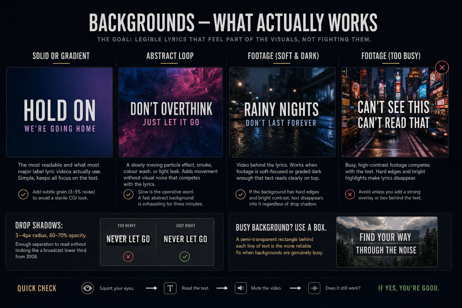
Solid or gradient — the most readable and what most major label lyric videos actually use. Simple, keeps all focus on the text. Add a subtle grain texture (3–5% noise) to avoid the sterile CGI look.
Abstract loop — a slowly moving particle effect, smoke, colour wash, or light leak. Adds movement without visual noise that competes with the lyrics. Slow is the operative word. A fast abstract background is exhausting for three minutes.
Footage — video behind the lyrics. Works when footage is soft-focused or graded dark enough that text reads clearly on top. If the background has hard edges and bright contrast, text disappears into it regardless of drop shadow.
Drop shadows: 3–4 pixel radius, 60–70% opacity. Enough separation to read without looking like a broadcast lower third from 2008. A semi-transparent rectangle behind each line of text is the more reliable fix when backgrounds are genuinely busy.
Making it fast: CapCut and Alight Motion
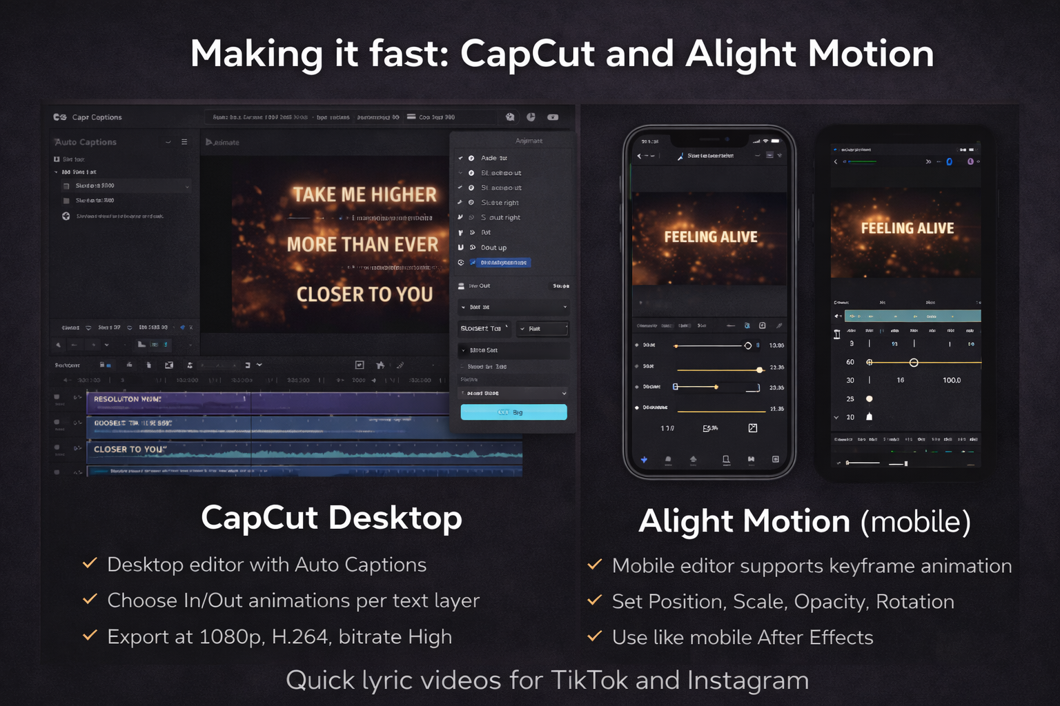
Not every lyric video needs After Effects. For short-form social content — TikTok lyric clips, Instagram Reels, short song previews — CapCut and Alight Motion are faster and the output looks fine.
CapCut desktop: add text → Animate → choose In/Out animations per layer. Auto Captions generates timed lyric text automatically from audio — not perfect, but saves the manual timing work on most lines. Export at 1080p, H.264, bitrate High. For a 60-second clip I can get from audio file to exported lyric video in under 25 minutes.
Alight Motion (mobile): the most capable mobile option for animated lyrics. Supports keyframe animation for position, scale, opacity, and rotation on text layers — essentially a mobile After Effects for this use case. The learning curve is steeper than CapCut but the results show it. Good for creators who do everything on a phone.
Reusing animations without rebuilding
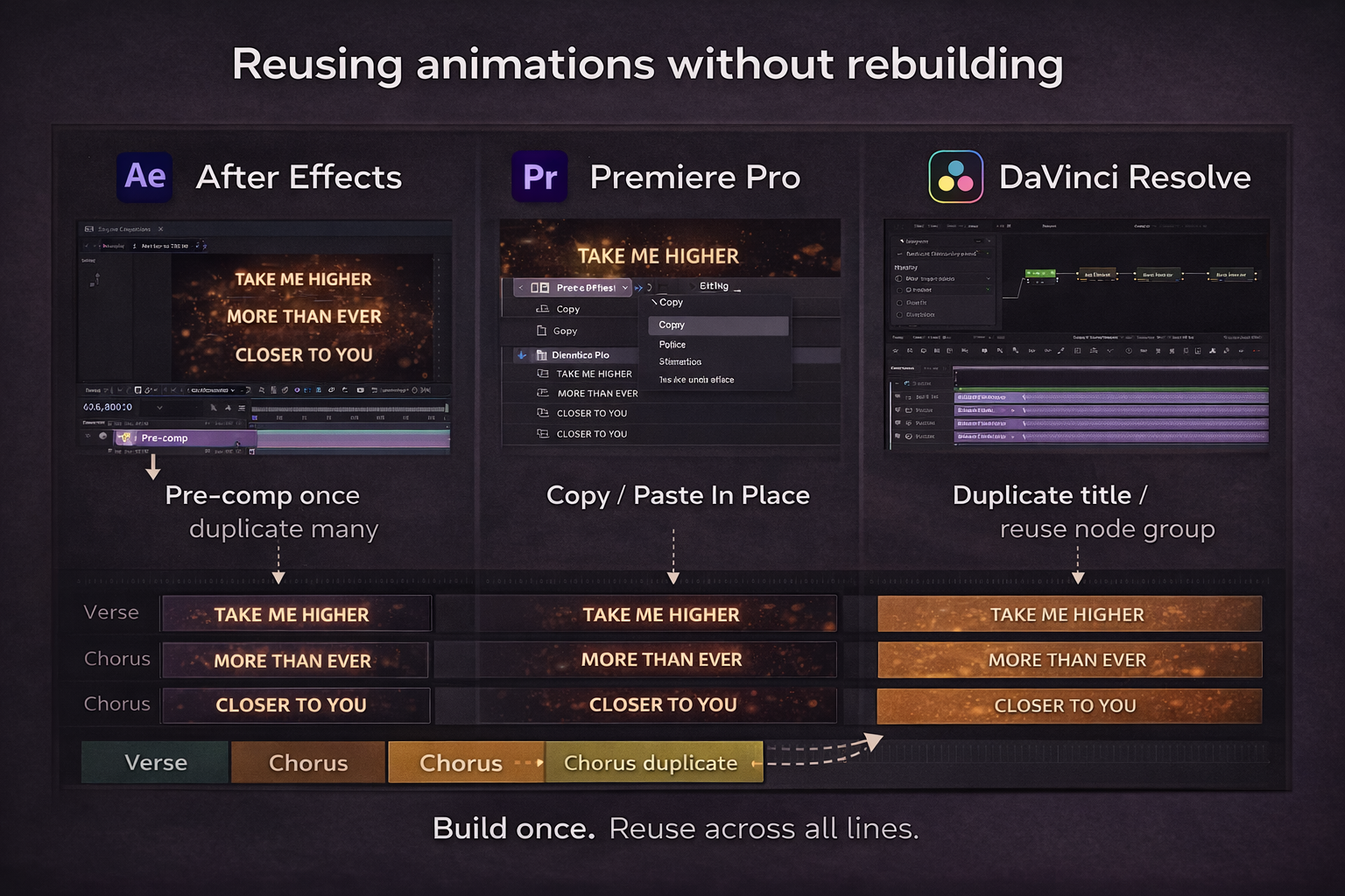
The biggest time drain in lyric video work is rebuilding the same animation for every line. Don't.
In After Effects: animate your first line. Pre-compose that layer. Copy and paste the pre-comp for every subsequent line. Change the text inside the pre-comp, adjust the in/out timing on the main timeline. Each additional line takes 30 seconds instead of ten minutes.
In Premiere Pro: animate your first title, right-click → Copy → Paste In Place for each subsequent line. Adjust clip position on the timeline to match the new timing. Animation keyframes come with it.
In DaVinci Resolve: on the Edit page, Alt-drag a title clip to duplicate. In Fusion, a compound node group containing your animation copies to each new text node. Set up the group once per project, reuse it across all 47 lines.
The chorus repeats — same lines, same melody, three times. Animate the chorus section once, duplicate the whole section, adjust timing on the duplicates. That's roughly 40 minutes saved per video that would otherwise go to rebuilding identical lines.
FAQ
What software is best for lyric videos? For simple fade-in/fade-out: DaVinci Resolve free or Premiere Pro. For kinetic typography with custom motion: After Effects is the standard. For quick social content: CapCut on mobile or desktop is fastest. For mobile-first with proper keyframe control: Alight Motion. After Effects gives the most control but requires the most learning.
How do I sync lyrics precisely? Zoom into the waveform until individual syllables show as peaks. Place your text layer's in-point at the peak for each word. Playing back and eyeballing gets you close. Working from the waveform gets you frame-accurate.
How long does a lyric video take to make? Simple fades for a full song: 2–3 hours the first time, under an hour once you have a system. Custom kinetic typography on every line: 8–12 hours. Time is almost entirely in the syncing and the per-line animation — the reuse system is what brings it down.
Can I make a lyric video without After Effects? Yes. DaVinci Resolve free handles mask reveals and basic kinetic animation in Fusion. Premiere Pro handles fade-in and Crop-based reveals. CapCut handles simple animated text for social content. After Effects becomes necessary when you need 3D text movement or complex physics — most lyric videos don't need that.
What's the typewriter effect and how do I make it? Text that appears character by character rather than all at once. In After Effects: select your text layer, Animate → Opacity → set to 0%, then keyframe the Range Selector's Start value from 0% to 100% over the word's duration. Each character reveals in sequence. Works well for rap and spoken word where the delivery tempo is the point.
How do I stop the background fighting the text? Use a simple background that doesn't compete, or add a 3–4 pixel drop shadow at 60–70% opacity to create separation. If the background is very busy, a semi-transparent solid behind each line is the most reliable fix — subtle enough not to look designed, effective enough to make the text readable.