How to Color Grade a Music Video to Match Your Genre

There's a shot in a hip-hop video that's been colour graded so many times it's basically a genre requirement now. Deep blacks. Skin tones pushed slightly warm. Highlights slightly crushed so nothing blows out. You've seen it a thousand times without knowing you were seeing it.
That's the thing about colour grading — when it's right, nobody notices it. They just feel like the video belongs to the genre. When it's wrong, something feels off and the viewer can't explain why. They think it's the performance, or the camera work, or something about the edit. Usually it's the colour.
This is a guide to getting it right for the genres you're actually working in.
Before you grade anything
Two things have to happen first, in this order.
Colour correct your footage. This means making your clips look neutral — fixing exposure, balancing white balance, making sure a shot at minute two looks like it was filmed in the same universe as a shot at minute four. Grading on top of uncorrected footage is like painting over a wall you haven't primed. The grade will fight the underlying problems the whole way through.
Match your clips. If you have five different shots of the same scene, they need to look like they were filmed at the same time before you apply any look. In DaVinci Resolve, the colour match tool does most of this automatically — select the clip you want to match, pick a reference frame, apply. It's not perfect but it gets you 80% of the way there in seconds.
Only after both of those do you start actually grading.
The tools you're actually going to use
You don't need to understand every colour tool in your editor. You need to understand three things:
Lift / Gamma / Gain (or Shadows / Midtones / Highlights — same thing, different labels depending on your editor). Lift controls the dark areas of your image. Gain controls the bright areas. Gamma is everything in between. Most of the look you're going for lives in how you push these against each other.
Saturation. How colourful everything is. Most genres either push saturation slightly up or pull it down. Very few genres live at "exactly where the camera put it."
Curves. An S-curve — slight boost in the highlights, slight dip in the shadows — adds contrast and makes footage feel more cinematic. It's the single most useful thing you can do to flat footage. Everything else is refinement on top of this.
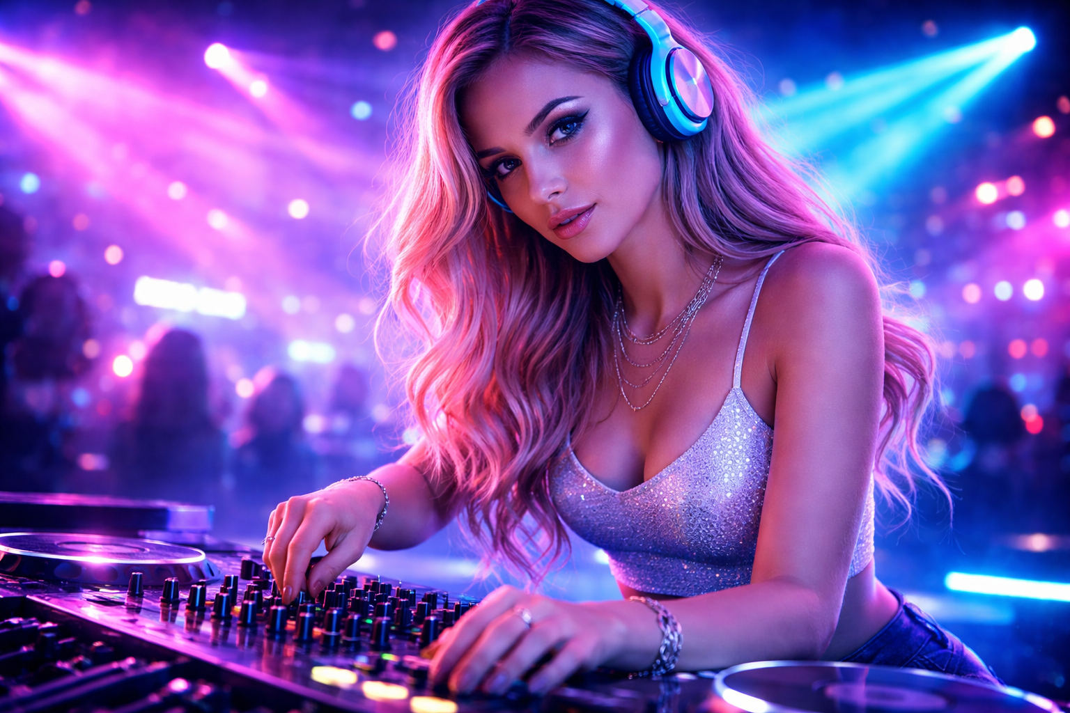
Hip-hop and rap
The reference feeling: expensive, deliberate, slightly heavy.
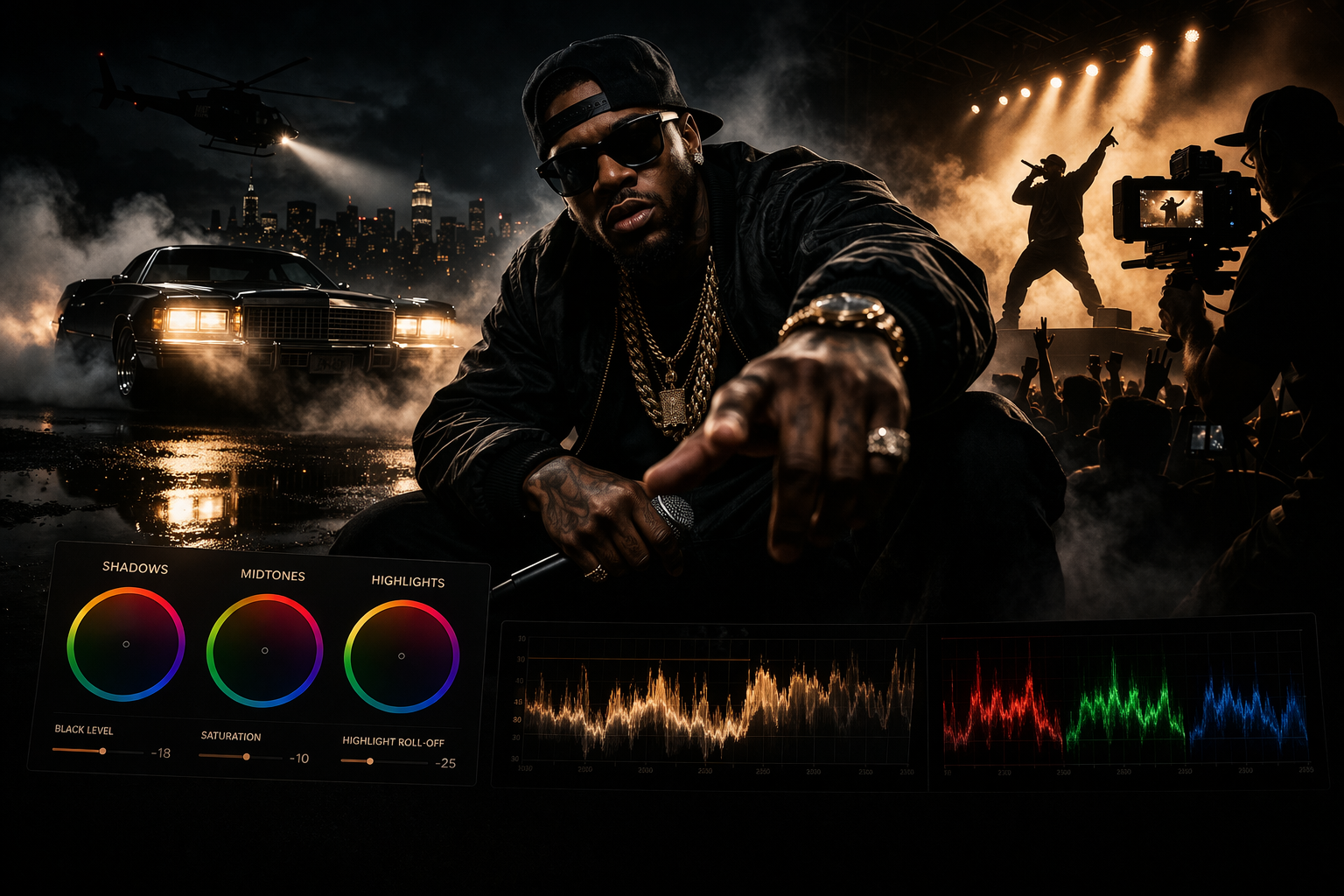
Hip-hop videos tend toward deep, crushed blacks — the shadows go almost completely dark. Skin tones stay warm but not orange. Highlights are pulled back so the image feels dense rather than airy.
In practice: pull your Lift down until the shadows feel heavy. Add a slight warm push to the midtones (orange-ish on the colour wheel, but subtle — you're not making it look sunset). Desaturate the highlights slightly so nothing bright feels cheap or overexposed. The overall image should feel like it has weight.
The mistake most people make: they push the saturation up trying to make it look vivid. Hip-hop grades are usually less saturated than you think, not more. The richness comes from the contrast, not the colour.
LUT starting point: any "cinematic dark" or "deep shadows" LUT as a base, then adjust from there. Don't use a LUT as a final grade — use it as a starting conversation.
R&B and soul
The reference feeling: warm, intimate, slightly soft.
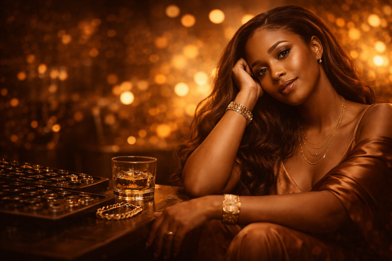
R&B sits in a different emotional register than hip-hop. The grade reflects that — warmer, less aggressive, with more detail in the shadows rather than crushing them. Skin tones are the centrepiece here. If the skin tones look wrong, nothing else matters.
In practice: push your midtones warm (amber to orange range on the colour wheel). Lift your shadows slightly — you want to see detail in the dark areas, not lose them. Reduce contrast slightly in the highlights so the brightest parts of the image feel soft rather than harsh. The result should feel like the video was shot in candlelight or golden hour, even if it wasn't.
The skin tone thing: use a qualifier (in DaVinci Resolve) or a selective colour tool to isolate skin tones and grade them separately from the rest of the image. This lets you warm the skin without warming the background into orange soup. This single technique improves R&B grades more than anything else.
Pop
The reference feeling: bright, clean, slightly heightened reality.
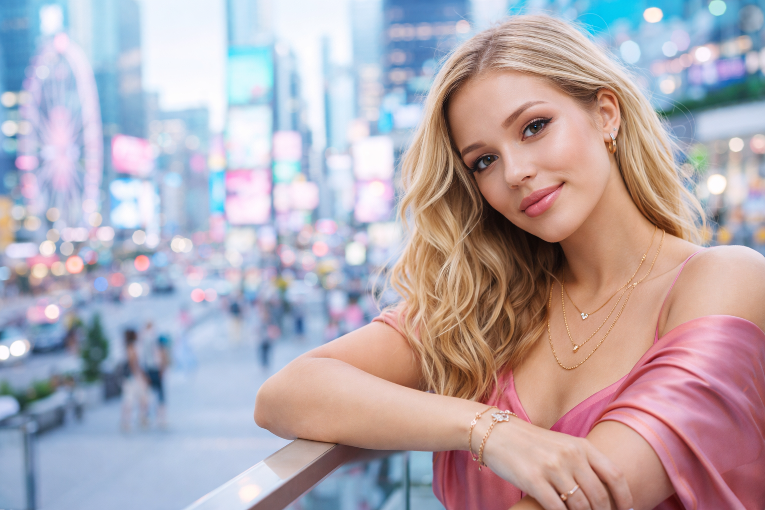
Pop videos often look like the world but better. Colours are slightly more saturated than real life. Skin tones are even and flattering. The overall brightness sits higher than other genres — airy rather than heavy.
In practice: bring your overall exposure up slightly. Add a small amount of saturation. Keep your blacks lifted — you don't want heavy shadows, you want a bright image that still has dimension. Skin tones should be accurate and clean rather than pushed warm or cool.
The difficult thing about pop: it looks simple but the margin for error is small. Heavy-handed grading is immediately obvious because there's nothing dramatic about the image to hide behind. The grade should feel invisible.
For more experimental or art-pop: everything above gets pushed further in one specific direction. Colours become stylised rather than realistic. Skin tones can go unnatural. You're making a visual world, not a documentary.
Rock and metal
The reference feeling: desaturated, high contrast, slightly cold or dirty.
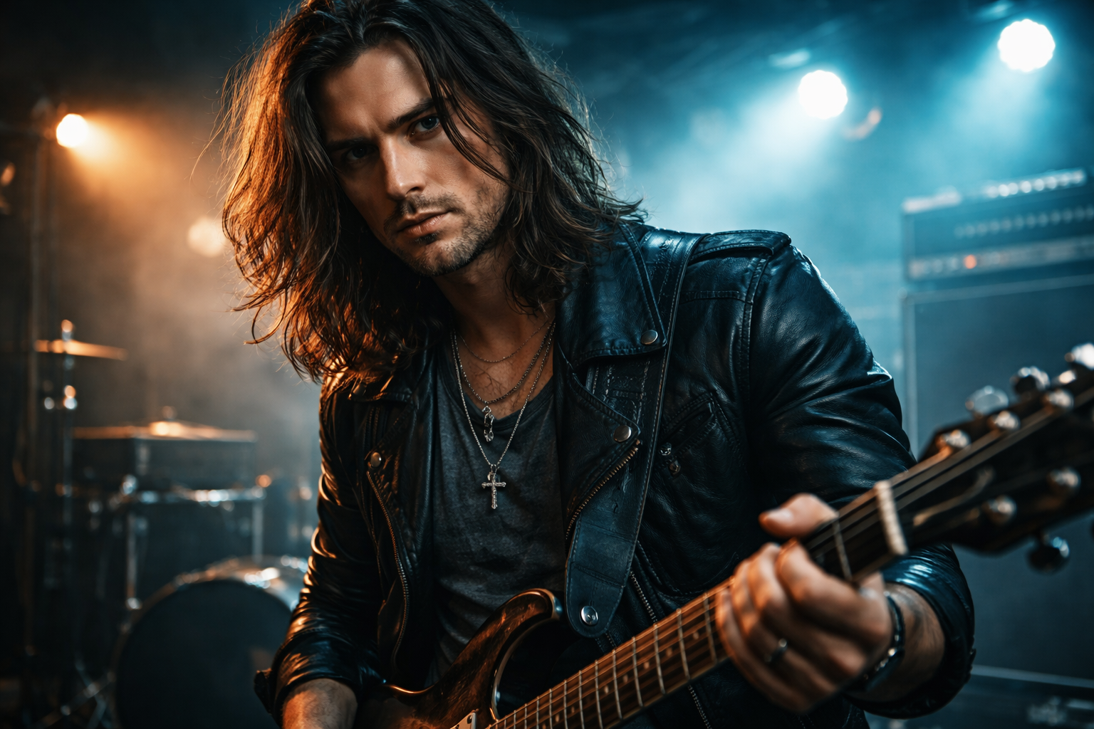
Rock videos typically desaturate toward the point where you're watching something that's almost black and white but not quite. Contrast is high — deep shadows, bright highlights, not much information in the midtones. The overall tone runs cool (blue or teal) in the shadows.
In practice: pull saturation down significantly — more than feels comfortable. Push your contrast hard with an aggressive S-curve. Add a slight teal or blue push to your shadows (the classic "teal and orange" look works well here, where shadows go teal and midtones or skin tones stay slightly warm). The result should feel like it was shot in a grimy room or under industrial lights.
The teal-and-orange grade: this is the most widely used professional colour grade in the world and it works especially well for rock. Your shadows and blacks go teal (blue-green). Your highlights and skin tones go warm (orange). The complementary colours create visual tension that reads as cinematic. In DaVinci Resolve, adjust the Lift colour wheel toward teal, the Gain toward orange/amber.
Electronic / EDM
The reference feeling: synthetic, neon, unreal.
EDM visuals often reject naturalism entirely. The grade is part of the world-building — heavily stylised colours, pushed saturation, artificial-feeling light. Blues, purples, and pinks feature heavily. The image should look like it was made inside a computer, even if it wasn't.
In practice: push saturation significantly higher than any other genre. Shift your highlights toward cool colours — blue, cyan, purple. The overall image can sit slightly darker to make the bright coloured elements pop. Skin tones here are less important — the genre allows (even expects) unnatural-looking skin.
The thing to avoid: overusing the colour effects in CapCut or Premiere's preset filters. They're recognisable and they look cheap. Build the grade manually, even if it takes longer. For EDM where the visual style is the point, a grade that looks like a preset undermines the whole thing.
Lo-fi and indie
The reference feeling: faded, nostalgic, slightly aged.
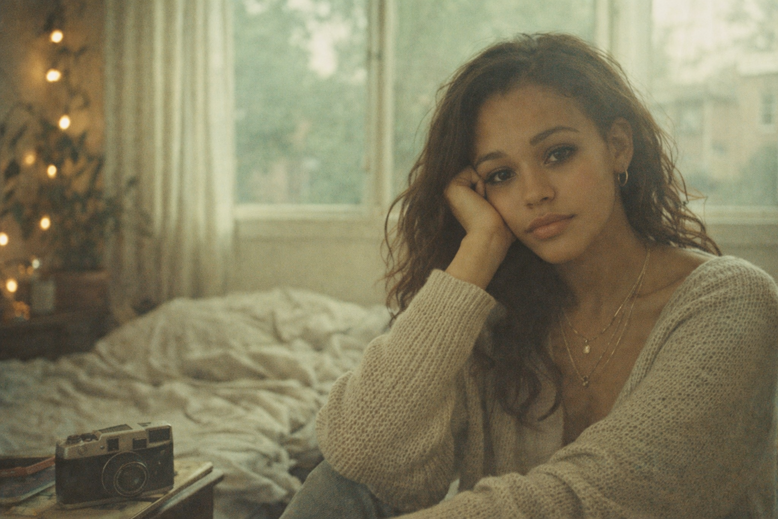
Lo-fi grades deliberately look like they weren't graded — or were graded to look like old film or video. Contrast is low. Blacks are lifted (never deep or crushed). Colours are slightly faded and desaturated. There's often a slight warm or green cast throughout.
In practice: the most important move is lifting your blacks. Take your Lift control and bring it up until the darkest parts of your image are a dark grey, not black. This alone creates the faded, aged feeling. Then pull saturation down slightly and add a very slight warm or green push to the shadows. The image should look like it was shot on a disposable camera or transferred from old tape.
Film grain helps here — a subtle grain overlay on top of the grade makes the whole thing feel like it belongs. Most editors have a grain plugin or effect. Keep it subtle enough that you're not sure if it's there.
A note on consistency
A grade that shifts between shots breaks immersion immediately.
Once you've built a look you're happy with, copy it to every clip in that scene before moving on. In DaVinci Resolve, you can apply a grade to multiple clips at once by selecting them all and using "Apply Grade." In Premiere, you copy the effect from one clip and paste it to others.
Then watch your edit back on a screen you haven't been staring at for three hours — a phone, a TV, whatever you can find. Grades that look good on a calibrated monitor can look completely wrong on a phone screen. Most of your viewers are watching on phones. This matters.
The question to ask before you grade
What does this song feel like?
Not what does it sound like. What does it feel like. Heavy and claustrophobic or open and airy? Warm and close or cold and distant? Aggressive or vulnerable?
The colour grade is the answer to that question in visual form. The genre gives you a starting point, but the specific song tells you where to land. Two hip-hop videos can have completely different grades because two hip-hop songs can feel completely different.
Start with the genre conventions. Then let the song tell you where to go from there.